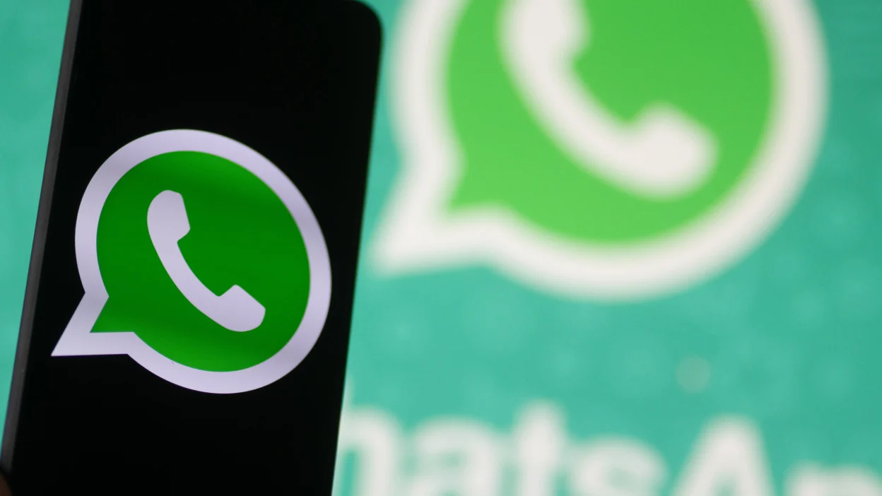
WhatsApp is preparing to release its most significant visual update in recent memory, introducing a design language that draws comparison to Apple’s liquid glass aesthetic. The Meta-owned messaging platform is reportedly testing a refreshed interface that prioritizes transparency, depth, and a more modern look.
The update, which has been observed in beta versions of the app, aims to modernize the user experience without altering core functionality. Early reports indicate changes to color schemes, iconography, and the overall layout of the chat interface, moving toward a more translucent and layered appearance.
Details of the Design Shift
The new design incorporates what is being described as a “liquid glass” effect. This involves the use of blurred backgrounds, semi-transparent elements, and subtle lighting effects that create a sense of depth. The visual approach is reminiscent of design principles used in Apple’s operating systems, particularly iOS and macOS, where glass-like textures are prominent.
Screenshots from beta versions show redesigned navigation bars, chat bubbles, and input fields. The traditional solid color backgrounds appear to be replaced with more dynamic, gradient-based schemes. The changes are intended to make the interface feel lighter and more contemporary.
Scope of the Update
This overhaul is not limited to a single platform. Developers are expected to roll out the changes across both iOS and Android versions of WhatsApp. The visual refresh will also extend to WhatsApp Web and the desktop application, ensuring a consistent experience across devices.
The update is primarily cosmetic. No major changes to the underlying messaging protocols, encryption standards, or core features such as end-to-end encryption, voice calls, or media sharing have been announced alongside this design work.
Background and Context
WhatsApp’s last major design overhaul was introduced several years ago, and the interface has largely remained stable since then. The introduction of dark mode was a significant visual addition, but the core layout and color palette have not seen a comprehensive update in some time.
Meta has been investing heavily in the WhatsApp brand, focusing on both feature development and user interface improvements. This design refresh is part of a broader strategy to keep the app competitive with other messaging platforms that have updated their visual identity more frequently.
Reactions and Implications
Early feedback from beta testers has been mixed. Some users appreciate the modernized look, citing the cleaner and more immersive feel of the glass-like elements. Others have raised concerns about potential readability issues with the increased use of transparency and lighter colors, particularly for users with visual impairments.
The update is also expected to affect battery performance on devices with OLED screens, as the use of darker elements in the default theme could lead to improved power efficiency. However, the impact will depend on the final implementation and the user’s chosen theme.
For third-party developers who work with WhatsApp’s API or offer custom themes, the design change will require adaptation to ensure compatibility with the new visual language. The update may break some existing customizations.
Expected Rollout
The new design is currently in beta testing and is not yet available to the general public. Meta has not provided an official release date for the stable version. Based on typical testing cycles, the update could begin rolling out in the coming weeks or months, with a staggered release to ensure stability.
Users who are part of the WhatsApp beta program on iOS or Android can test the new interface immediately. The full public release is expected to follow after feedback is incorporated and any bugs or issues are resolved.
Source: Mashable